A Simple Scatterplot using SPSS Statistics
Introduction
A simple scatterplot can be used to (a) determine whether a relationship is linear, (b) detect outliers and (c) graphically present a relationship between two continuous variables. For example, determining whether a relationship is linear (or not) is an important assumption if you are analysing your data using Pearson's product-moment correlation, Spearman's rank-order correlation, simple linear regression, multiple regression, amongst other statistical tests.
Note: If you are analysing your data using an ANCOVA (analysis of covariance) or two-way ANOVA, for example, you will need to consider a grouped scatterplot instead (N.B., if you need help creating a grouped scatterplot using SPSS Statistics, we show you how in our enhanced content).
For example, a simple scatterplot could be used to determine if there is a linear relationship between lawyers' salaries and the number of years they have practiced law (i.e., your dependent variable would be "salary" and your independent variable would be "years practicing law"). A simple scatterplot could also be used to determine if there is a linear relationship between the distance women can run in 30 minutes and their VO2max, which is a measure of fitness (i.e., your dependent variable would be "distance run" and your independent variable would be "VO2max").
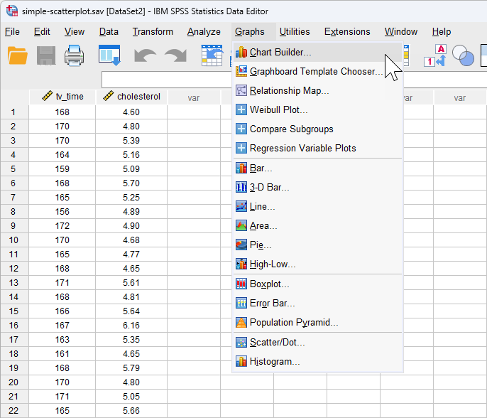
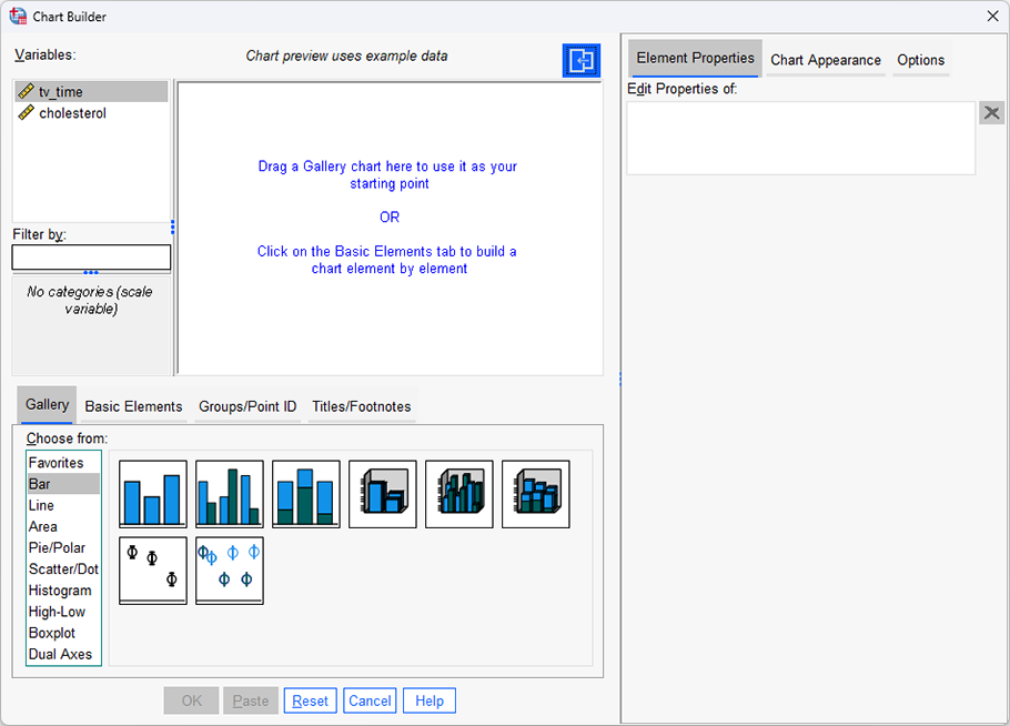
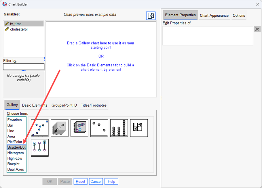
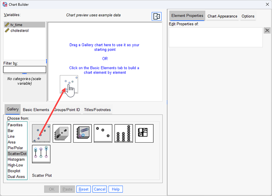
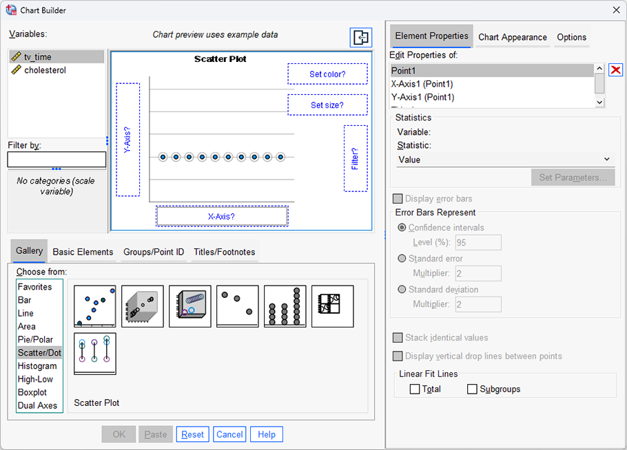
The purpose of this guide is to show you how to create a simple scatterplot using SPSS Statistics. First, we introduce the example we have used in this guide. Next, we show how to use the Chart Builder in SPSS Statistics to create a simple scatterplot based on whether you have SPSS Statistics versions 29 or 30 (or the subscription version, versions 27 or 28, versions 25 or 26, or version 24 or an earlier version of SPSS Statistics. If you are unsure which version of SPSS Statistics you are using, see our guide: Identifying your version of SPSS Statistics.
SPSS Statistics
Example used in this guide
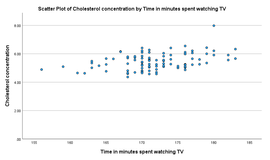
This guide will use the example from the linear regression guide, where researchers wanted to determine if there was a linear relationship between cholesterol concentration (a type of fat in the blood) and the time spent watching TV in otherwise healthy 45 to 65 year old men (an at-risk category of people for heart disease). They believed that there would be a positive relationship: the more time people spent watching TV, the greater their cholesterol concentration.
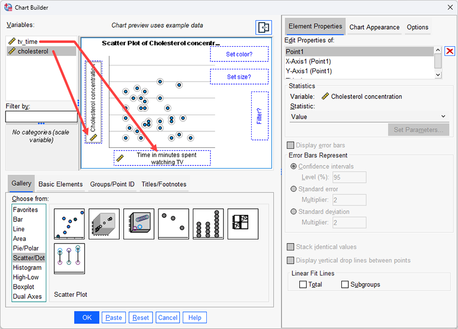
Daily time spent watching TV was recorded in the variable time_tv and cholesterol concentration recorded in the variable cholesterol. Therefore, to determine whether a linear relationship exists between the two continuous variables, which is one of the assumptions that must be met when running a linear regression, the researchers generated a simple scatterplot by plotting the dependent variable, cholesterol, against the independent variable, time_tv.