Histograms
What is a histogram?
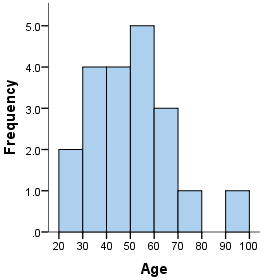
A histogram is a plot that lets you discover, and show, the underlying frequency distribution (shape) of a set of continuous data. This allows the inspection of the data for its underlying distribution (e.g., normal distribution), outliers, skewness, etc. An example of a histogram, and the raw data it was constructed from, is shown below:

| 36 |
25 |
38 |
46 |
55 |
68 |
72 |
55 |
36 |
38 |
| 67 |
45 |
22 |
48 |
91 |
46 |
52 |
61 |
58 |
55 |
How do you construct a histogram from a continuous variable?
To construct a histogram from a continuous variable you first need to split the data into intervals, called bins. In the example above, age has been split into bins, with each bin representing a 10-year period starting at 20 years. Each bin contains the number of occurrences of scores in the data set that are contained within that bin. For the above data set, the frequencies in each bin have been tabulated along with the scores that contributed to the frequency in each bin (see below):
| Bin | Frequency | Scores Included in Bin |
| 20-30 | 2 | 25,22 |
| 30-40 | 4 | 36,38,36,38 |
| 40-50 | 4 | 46,45,48,46 |
| 50-60 | 5 | 55,55,52,58,55 |
| 60-70 | 3 | 68,67,61 |
| 70-80 | 1 | 72 |
| 80-90 | 0 | - |
| 90-100 | 1 | 91 |
Notice that, unlike a bar chart, there are no "gaps" between the bars (although some bars might be "absent" reflecting no frequencies). This is because a histogram represents a continuous data set, and as such, there are no gaps in the data (although you will have to decide whether you round up or round down scores on the boundaries of bins).
Choosing the correct bin width
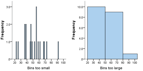
There is no right or wrong answer as to how wide a bin should be, but there are rules of thumb. You need to make sure that the bins are not too small or too large. Consider the histogram we produced earlier (see above): the following histograms use the same data, but have either much smaller or larger bins, as shown below:
We can see from the histogram on the left that the bin width is too small because it shows too much individual data and does not allow the underlying pattern (frequency distribution) of the data to be easily seen. At the other end of the scale is the diagram on the right, where the bins are too large, and again, we are unable to find the underlying trend in the data.
Histograms are based on area, not height of bars
In a histogram, it is the area of the bar that indicates the frequency of occurrences for each bin. This means that the height of the bar does not necessarily indicate how many occurrences of scores there were within each individual bin. It is the product of height multiplied by the width of the bin that indicates the frequency of occurrences within that bin. One of the reasons that the height of the bars is often incorrectly assessed as indicating frequency and not the area of the bar is due to the fact that a lot of histograms often have equally spaced bars (bins), and under these circumstances, the height of the bin does reflect the frequency.
What is the difference between a bar chart and a histogram?
The major difference is that a histogram is only used to plot the frequency of score occurrences in a continuous data set that has been divided into classes, called bins. Bar charts, on the other hand, can be used for a great deal of other types of variables including ordinal and nominal data sets.