Creating a Clustered Bar Chart using SPSS Statistics (cont...)
SPSS Statistics
SPSS Statistics procedure for versions 25 and 26
The 11 steps that follow show you how to create a clustered bar chart in SPSS Statistics versions 25 and 26 using the example on the page 1.
Note: If you are unsure which version of SPSS Statistics you are using, see our guide: Identifying your version of SPSS Statistics.
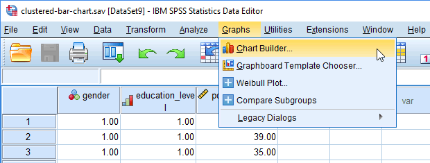
- Click Graphs > Chart Builder... on the main menu, as shown below:

Published with written permission from SPSS Statistics, IBM Corporation.
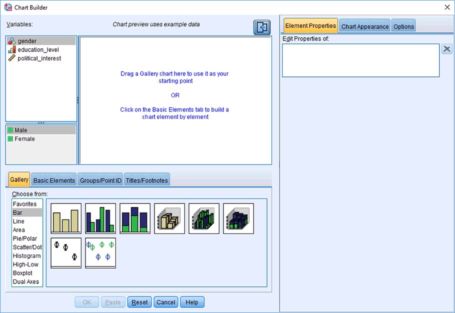
You will be presented with the Chart Builder dialogue box, as shown below:
Published with written permission from SPSS Statistics, IBM Corporation.
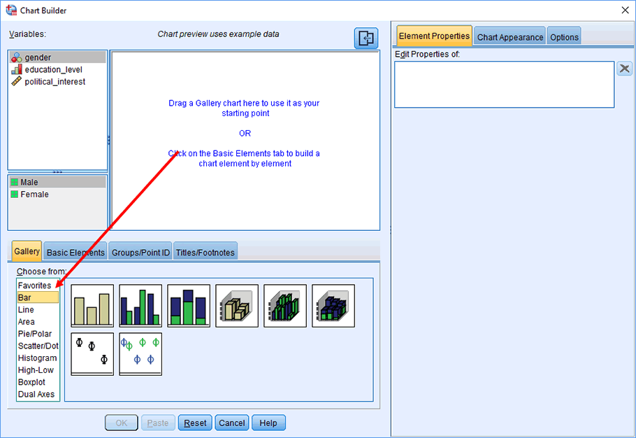
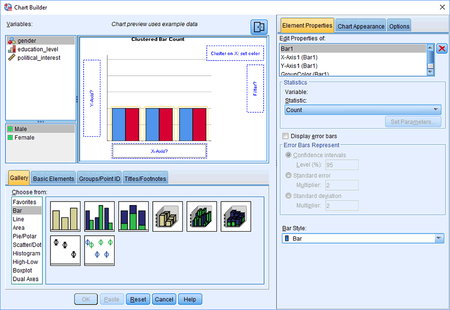
- Select "Bar" from the Choose from: box in the bottom-left-hand corner of the Chart Builder dialogue box, as highlighted below:
Published with written permission from SPSS Statistics, IBM Corporation.
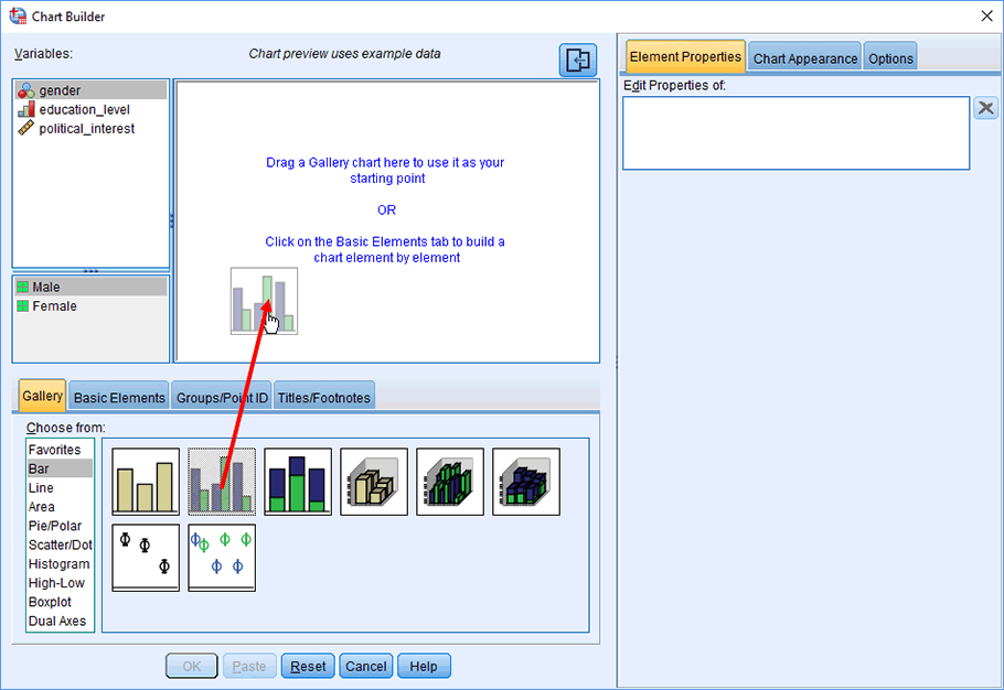
- Selecting "Bar" will present eight different bar chart options in the lower-middle section of the Chart Builder dialogue box (as shown above and below). Drag-and-drop the option that is second from the left on the top row (you will see it labelled as "Clustered Bar" if you hover your mouse over the box) into the main chart preview pane, as shown below:
Published with written permission from SPSS Statistics, IBM Corporation.
- You will be presented with the screen below, which shows a clustered bar chart in the main chart preview pane with boxes for the y-axis ("Y-Axis?"), x-axis ("X-Axis?") and "Cluster on X: set color" for you to populate with the appropriate variables.
Published with written permission from SPSS Statistics, IBM Corporation.
Note: You can ignore the "Filter?" box.
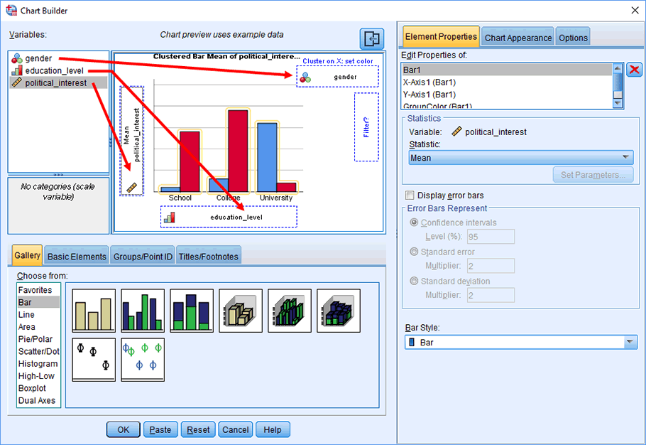
- Drag-and-drop the independent variable, education_level, from the Variables: box into the "X-Axis?" box in the main chart preview screen. Do the same for the dependent variable, political_interest, but into the "Y-Axis?" box. Next, drag gender into the "Cluster on X: set color" box. You should end up with a screen like below:
Published with written permission from SPSS Statistics, IBM Corporation.
Note 1: The chart preview pane does not accurately plot the variable data that you have dragged across in its preview pane, even though it might appear that it does due to the bar chart's bars changing when you add your variables. Therefore, do not get confused and think that you have done something wrong. You will only see your true data when you actually generate the clustered bar chart.
Note 2: You could easily swap the two independent variables around without any problems. The reason for the order used in this guide is due to the way in which the two-way ANOVA problem is phrased, such that it is preferable to compare gender at each level of education_level in this particular example.
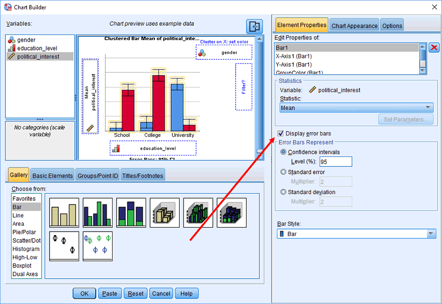
- Click Display error bars in the dialogue box, which will activate the –Error Bars Represent– area. Select Confidence intervals and Level (%): set at 95. You will be presented with the following screen:
Published with written permission from SPSS Statistics, IBM Corporation.
Note 1: You do not have to select error bars, but it is common in academia to do so. We illustrate a clustered bar chart with and without error bars at the end of the guide.
Note 2: You can use this area to select other types of error bars, such as multiples of either the standard error or standard deviation.
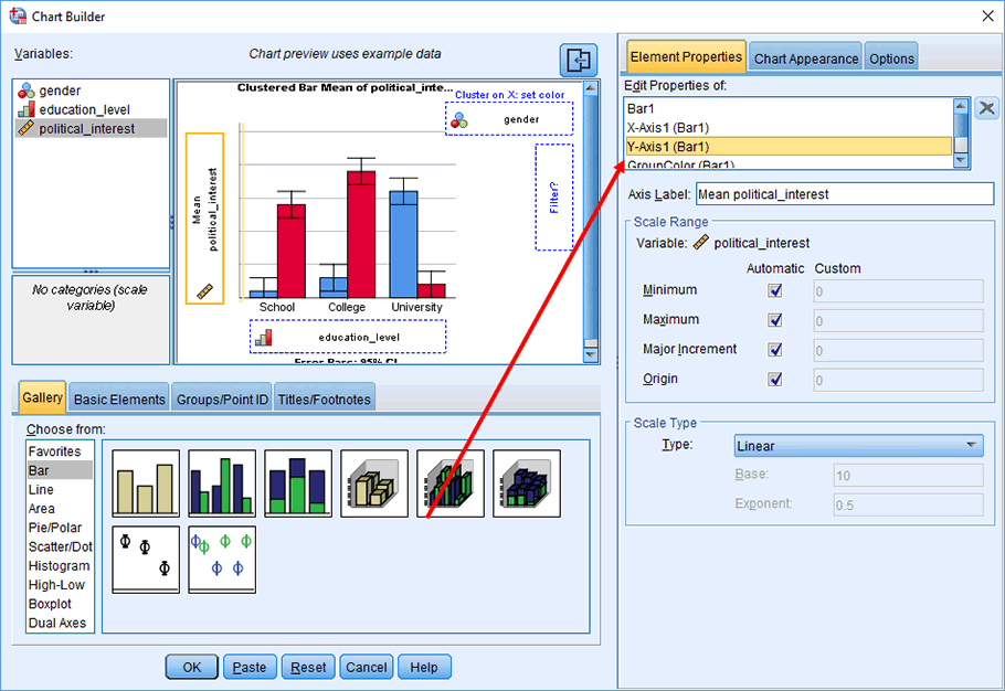
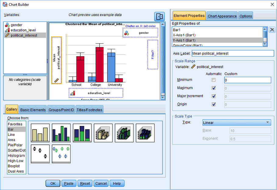
- Click on "Y-Axis1 (Bar1)" in the dialogue box and you will be presented with the following screen:
Published with written permission from SPSS Statistics, IBM Corporation.
Note: You can use this dialogue box to change the axis label (using the Axis Label: box) and/or change scale attributes using the options in the –Scale Range– area.
- If you want to change the scale on the y-axis of the dependent variable, political_interest, for example, the minimum value, uncheck the Minimum option in the –Scale Range– area so that the Custom value is highlighted and has a value of 0 (zero), as shown below. In this example, everything is OK as it is.
Published with written permission from SPSS Statistics, IBM Corporation.
Note: The procedure above is intended to make the y-axis show a suitable range of values for political_interest. These values might be different for your variables, so you should adjust them as you see fit. If you are not sure at first what these values should be, don't change the values; see what the clustered bar chart looks like and then re-run the clustered bar chart with new axes values if necessary. You can also re-edit the clustered bar chart later on.
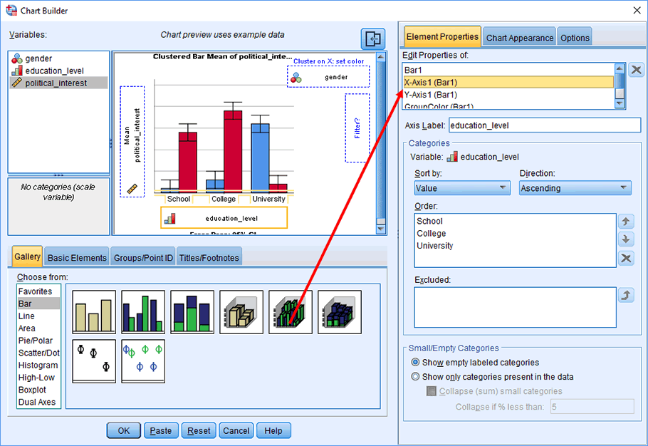
- If you want to change the order of the categories of the independent variable that you have placed on the x-axis (i.e., the independent variable, education_level), click on "X-Axis1 (Bar1)" in the Edit Properties of: box. This will activate the –Categories– and –Small/Empty Categories– areas, as well as the Legend Label: option. Leave the default options selected. However, if you want to change the order of the categories of the independent variable, you can do this in the Order: box in the –Categories– area using the and arrows. In this example, everything is OK as it is.
Published with written permission from SPSS Statistics, IBM Corporation.
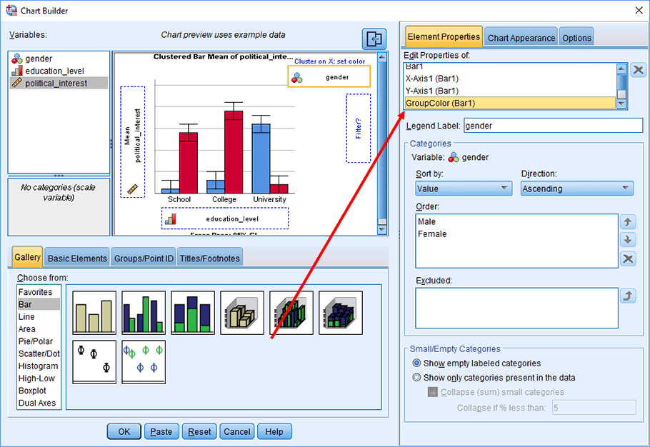
- You can also change the order of the categories of the independent variable
that was entered into the "Cluster on X: set color" box (i.e., the independent variable, gender) by clicking on "GroupColor (Bar1)" in the Edit Properties of: box and then following the procedure above (i.e., use the and arrows to change the order of the categories in the Order: box). The dialogue box when "GroupColor (Bar1)" is selected is shown below:
Published with written permission from SPSS Statistics, IBM Corporation.
- Click on the button in the Chart Builder dialogue box to generate the clustered bar chart, as shown below:
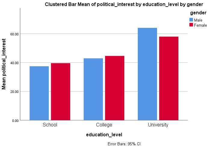
Published with written permission from SPSS Statistics, IBM Corporation.
Note: If the type of clustered bar chart that you want to create is different from the example above or there are specific options you want to include in your clustered bar chart that we have not covered, please contact us. We will try to add a section to the guide that deals with the type of clustered bar chart you want to create.