Creating a Clustered Bar Chart using SPSS Statistics
Introduction
A clustered bar chart is helpful in graphically describing (visualizing) your data. It will often be used in addition to inferential statistics. A clustered bar chart can be used when you have either: (a) two nominal or ordinal variables and want to illustrate the differences in the categories of these two variables based on some statistic (e.g., a count/frequency, percentage, mean, median, etc.); or (b) one continuous or ordinal variable and two nominal or ordinal variables and want to illustrate the differences in the continuous variable (which typically acts as a dependent variable) in terms of the categories of the two nominal or ordinal variables (which typically act as independent variables). For example, a clustered bar chart can be appropriate if you are analysing your data using a chi-square test for association, a two-way ANOVA, two-way repeated measures ANOVA, and two-way mixed ANOVA.
Note: If you are using an an independent-samples t-test, paired-samples t-test (dependent t-test), one-way ANOVA or repeated measures ANOVA, you might want to consider a simple bar chart instead.
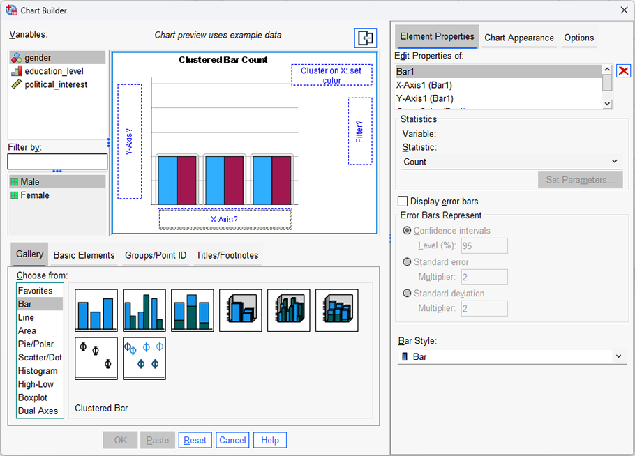
For example, a clustered bar chart could be used to illustrate the differences in the number of times shoppers preferred one of 5 different brands of ice cream when eating at home compared to eating out (i.e., the statistic being measured could be a "count/frequency", and the two variables, which are both nominal, would be "brand preference" – which has five categories: "ice cream brand A", "ice cream brand B", "ice cream brand C", "ice cream brand D" and "ice cream brand E" – and "place of consumption", which has two categories: "at home" and "eating out").
Alternatively, a clustered bar chart could be used to illustrate the differences in the continuous dependent variable, cholesterol, based on the ordinal independent variable, physical activity level (i.e., consisting of four levels to represent the "sedentary", "low", "moderate" and "high" physical activity groups who participated in a study) and the nominal variable: gender (i.e., consisting of two categories: "males" and "females"). Alternatively, a clustered bar chart could be used to illustrate the differences in the ordinal dependent variable, satisfaction level (consisting of five levels to represent how satisfied customers felt: "very satisfied", "somewhat satisfied", "neither satisfied nor dissatisfied", "somewhat dissatisfied" and "very dissatisfied"), based on two nominal independent variables: mobile phone brand (consisting of four groups: "Apple", "Nokia", "Samsung", and "Sony") and a second, nominal independent variable, US mobile carriers (consisting of three groups: "AT&T", "Sprint" and "Verizon Wireless").
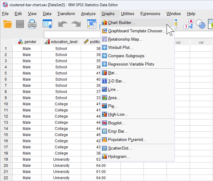
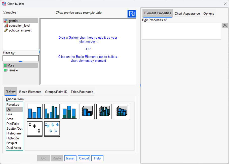
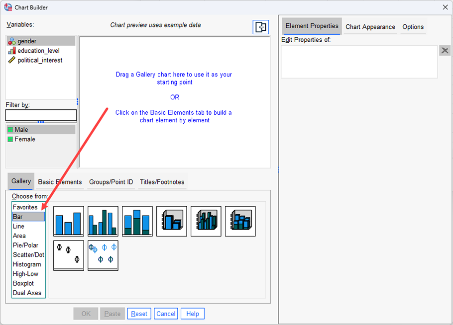
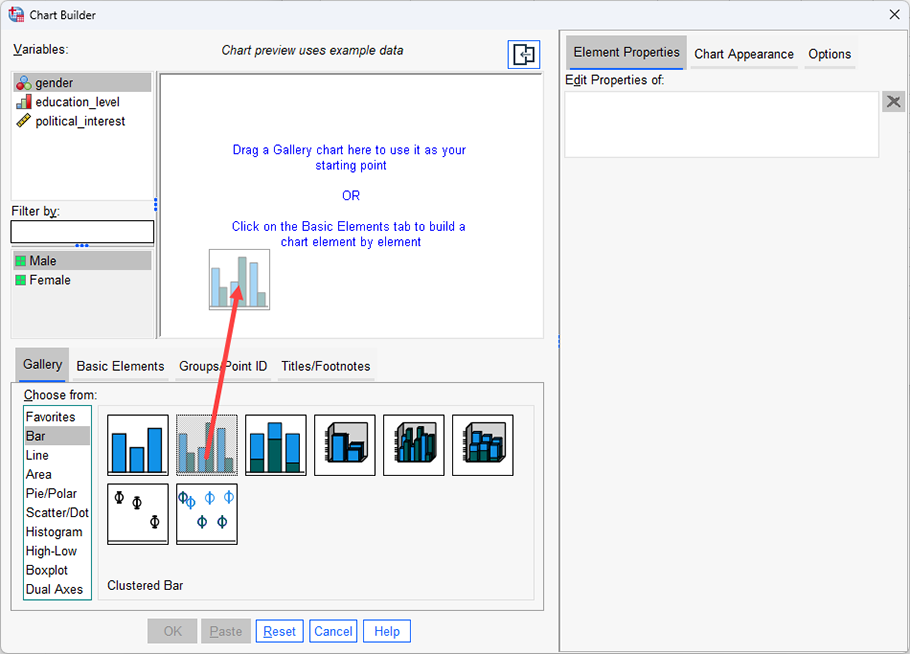
The purpose of this guide is to show you how to create a clustered bar chart using SPSS Statistics. First, we introduce the example we have used in this guide. Next, we show how to use the Chart Builder in SPSS Statistics to create a clustered bar chart based on whether you have SPSS Statistics versions 29 or 30 (or the subscription version of SPSS Statistics), versions 27 or 28, versions 25 or 26, or version 24 or an earlier version of SPSS Statistics. If you are unsure which version of SPSS Statistics you are using, see our guide: Identifying your version of SPSS Statistics.
SPSS Statistics
Example used in this guide
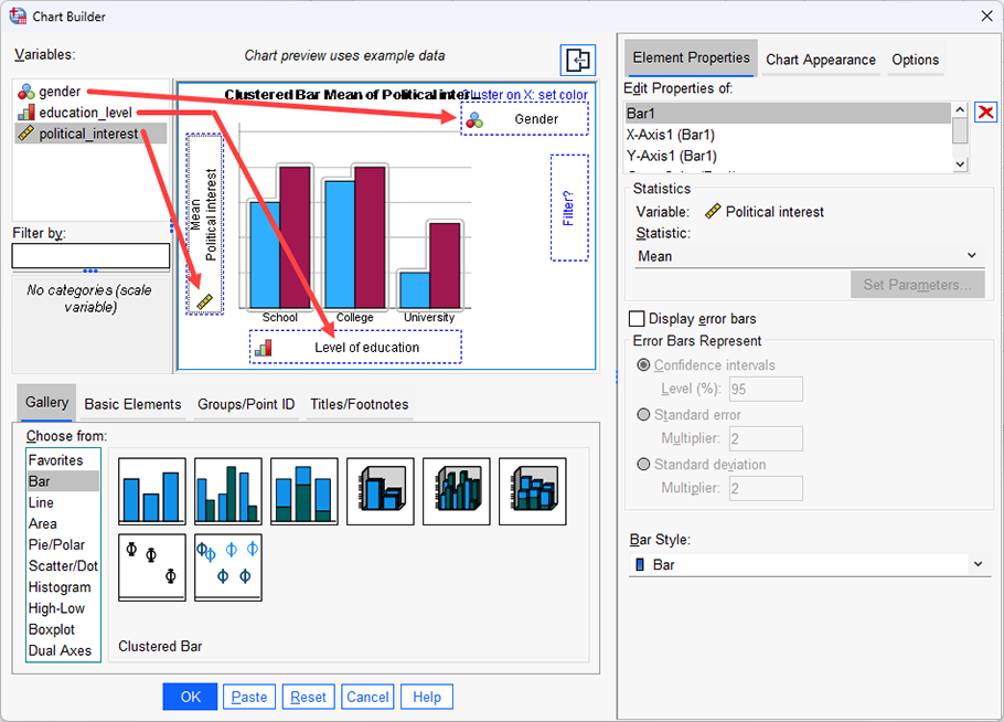
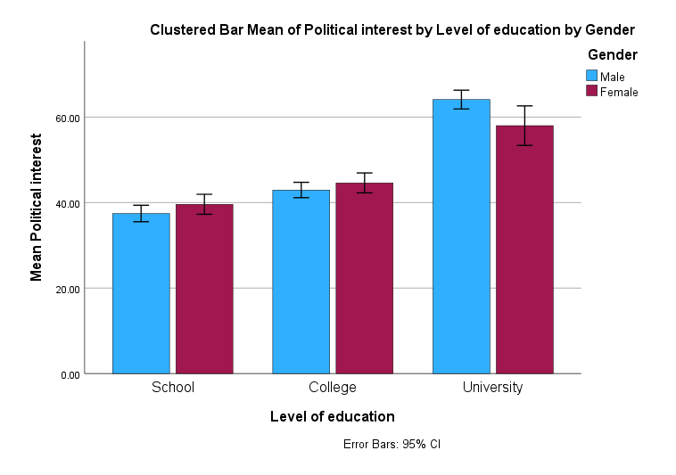
A researcher was interested in whether an individual's interest in politics was influenced by their level of education and their gender. The researcher recruited a random sample of participants and asked them about their interest in politics, which they scored from 0 - 100 with higher scores indicating a greater interest. The researcher then divided the participants by gender (Male/Female), and then again by level of education (School/College/University).
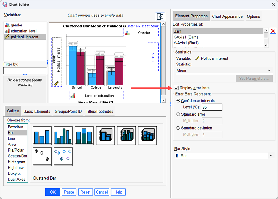
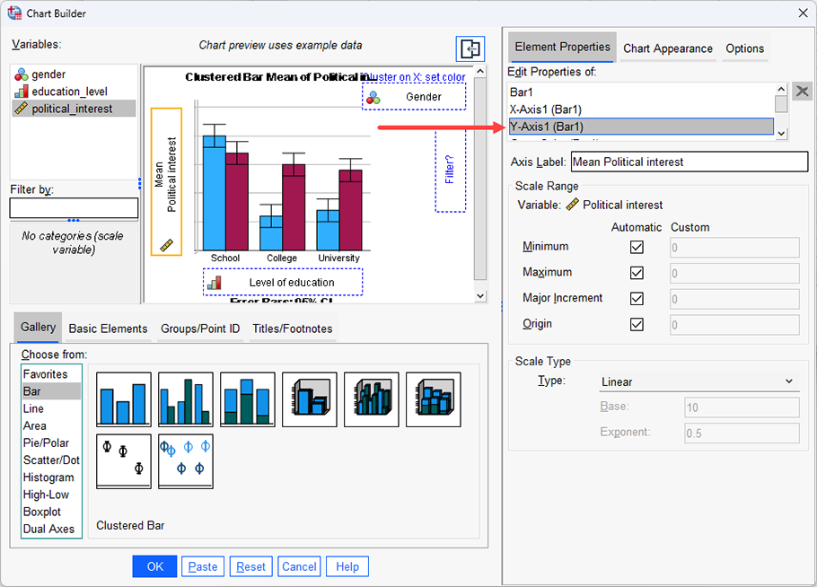
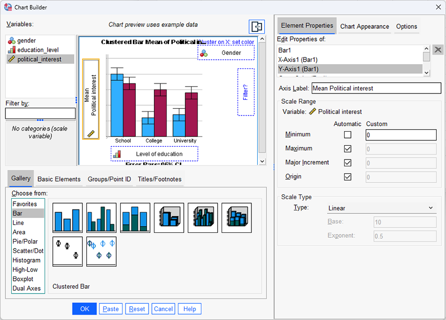
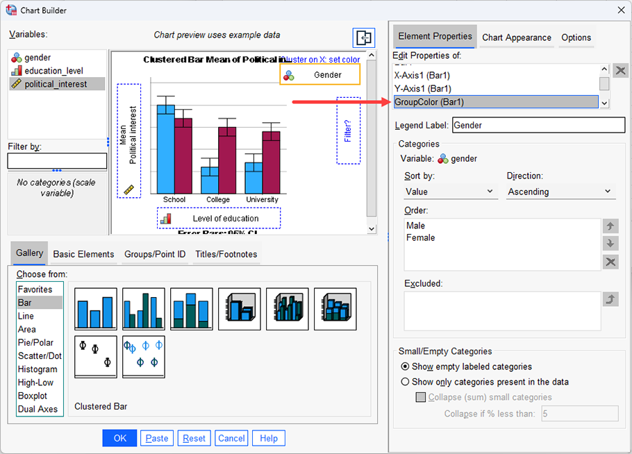
Therefore, this guide shows you how to create a clustered bar chart of the continuous dependent variable, political_interest (i.e., representing a person's 'interest in politics'), against the nominal independent variable, gender (which has two categories: "Male" and "Female"), and the ordinal independent variable, education_level (i.e., representing a person's highest educational qualification, which has three levels: "School", "College" and "University"). This guide will also show you how to add error bars (in this case, using confidence intervals).
Note: The example is based on the data from our introductory two-way ANOVA guide. If you want to analyse your data using a two-way ANOVA, our introductory guide will help get you started.