Learn how to accurately interpret and report your results.
Our guides show you how to accurately interpret and report your results. While SPSS Statistics produces many tables of output, you often only need to interpret and report a small proportion of the figures/numbers within these tables. We show you how to understand these tables of output, what part of this output you need to look at, and how to write up the results in a number of different formats. Where you need to interpret and report graphs and charts, we show you how to do this also. You can read what our users' say below, or learn more about Understanding SPSS Statistics Output, Presenting graphs and charts and Writing up your results.


- Understanding SPSS Statistics Output
We help you to understand the tables and graphs that SPSS Statistics produces when you analyse your data. Since SPSS Statistics produces many tables of output for the typical tests you will run, we tell you which tables are relevant, and which you can ignore. For each table that is relevant to your analysis, our guides explain what each figure and number means. Where you need to interpret graphs and charts, we also explain how to do this. We illustrate the output using examples, explaining how to understand results that are statistically significant, as well as those that were not. In all our guides, we explain the output that SPSS Statistics produces using straightforward, jargon-free language, assuming that you have little or no knowledge of statistics. The purpose of our guides is to ensure that you can interpret your own results.
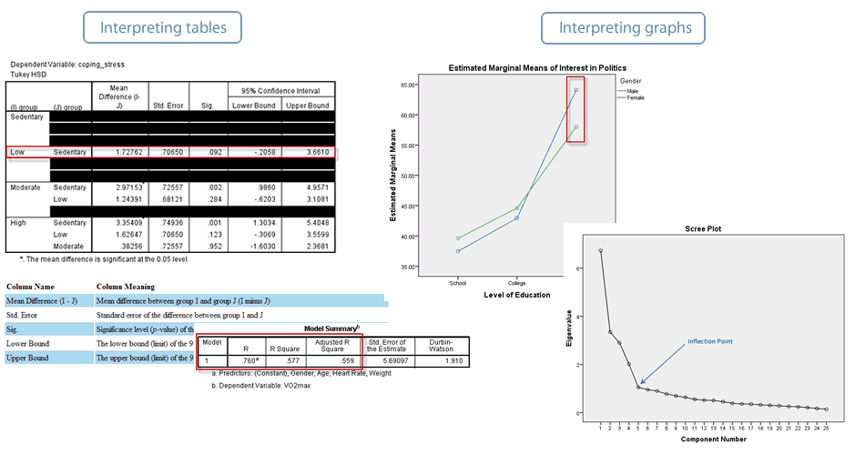

- Presenting data in graphs and charts
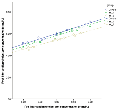
You will often not only write up your results, but also illustrate your results using graphs and charts. Since producing properly labelled and formatted graphs and charts can be time consuming, we show you how to do this using SPSS Statistics. In addition to showing you how to do this for each statistical test, where appropriate, we have generic guides that will help you to create bar charts, clustered bar charts, scatterplots, grouped scatterplots and boxplots.

- Writing up your results
When it comes to finally writing up your results, we show you how to do this using an appropriate reporting style (i.e., the APA style or a general reporting style). We also show you how to write up the results from your assumptions tests. As you work through the various assumptions tests and SPSS Statistics procedures required to carry out a statistical test, we show you how to accurately write up each part of your output. At the end of each guide, we show you how you can bring together all your results into a single results statement.
